top of page


Callback Films - Callie Che's A2 Media Evaluation
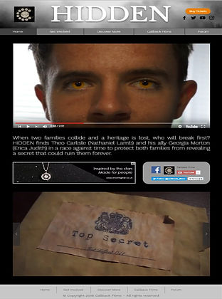
Website

Main Product
Ancillaries
Magazine
Poster
How effective is the combination of your main product and ancillary texts?
Characters
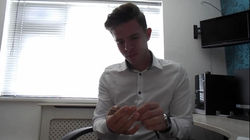
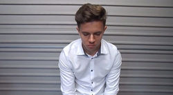
In all my texts, I have created a main focus on a single character, the protagonist. This establishes who the protagonist is and draws attention when he appears in the trailer since the audience is aware of his position within the plot. By using the same character consistently, I am able to create a link between my texts which allows the audience to create associations between each text. This thus familiarises the audience with the characters so they are able to draw deeper connections to the characters when the final product is released. This is effective as a combination of my main product and ancillary texts because I am able to convey the focal point of my production by using the same character as a repeated symbol across my texts.
 Nathan 3 |
|---|
 Nathan |
 Nathan 2 |
 IMG_0246_edited |
 IMG_0240_edited |
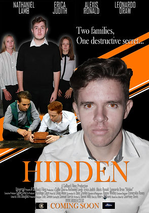
Billing Block
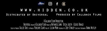

A billing block is an important convention of trailers and film posters, this block of text gives credit and usually consists of the companies, actors, directors, and producers involved. I have included a billing block at the end of my trailer and at the bottom of my poster to match conventions found in real media texts. I have created an effective combination with my billing block by using the same information and style across both texts. Also, I have used the same font for both billing blocks to create consistency across my texts. By using a billing block, I have created cross media convergence across my texts by linking to the website, and demonstrated synergy by including the production and distribution company logos in this section.
Colour Scheme


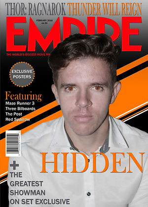
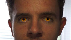
Colour schemes are often viewed as important aspects of design and development. The use of specific colour schemes may create certain impacts or elicit certain responses. The colour scheme I chose to use across all of my texts consisted of orange, grey, black, and white. This colour scheme was mainly drawn from the image of my protagonist; orange from the glowing eyes, grey from the collar of his shirt, white from his shirt, and black from his pupils. By using colours from the image, I am able to connect the overall design to the image, therefore creating a text that appears to be more visually complete. This colour scheme may evoke certain responses from the audience due to the psychological impacts of specific colours. For example, orange has connotations of energy, stimulation, and wealth prosperity, all of which link to the plot and character. By using the same colour scheme across all of my texts and the same pattern in my poster and magazine, I have effectively combined my texts through consistency which the audience recognises and familiarises themselves with.
Fonts
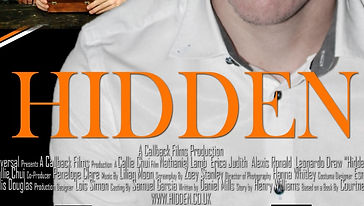
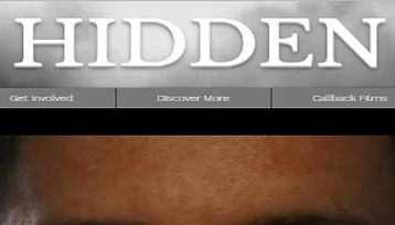
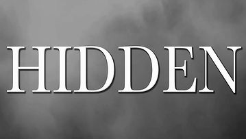
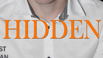
A font can often be used to create a basic perception of a product which can therefore attract the target audience. By using the same or similar fonts across all my texts, my texts are more easily recognised and can be placed as part of the same production. For example, I use the same font for my title across all my texts, this makes it easier to identify since the audience are able to draw immediate links between each text. I have used 'Baskerville' for my title, a serif font which I have used in orange in my poster and magazine, and in white in my website and main product. This font has connotations of professionalism which link to the high status of my characters.
bottom of page